Backing a Cut File + Mixed MediaHappy (belated) Valentine's Day! I was feeling the love this holiday, so I wanted to make a love-themed layout. I browsed through my cut files and decided on this large title by Paige Evans. I backed it with a rainbow of patterned and solid papers, using pastel colors to keep the layout soft and airy. Here's how it turned out! 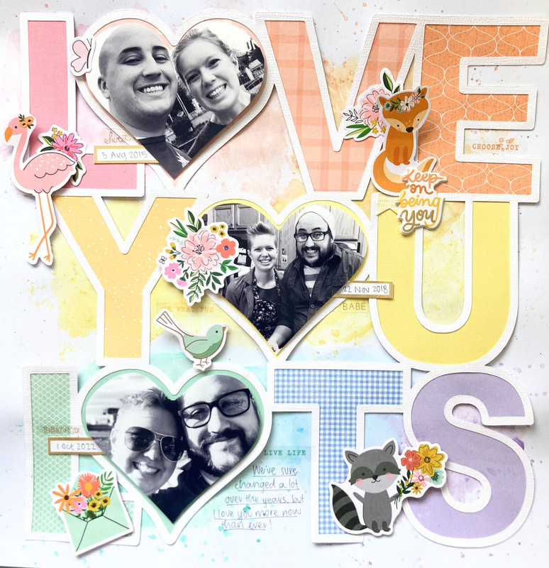 To make the white border of the cut file stand out, I did some tone-on-tone mixed media behind the cut file on plain white cardstock. To get these light pastel colors, I used two Prima watercolor palettes: Vintage Pastels and Woodlands. I used lots of water to make sure the colors stayed light. This is a "through the years" type layout, so I have three pictures spanning about 7 years. I printed all of them in black and white so that the pictures feel cohesive despite being in different times and places. Finally, I used some very old Jen Hadfield stickers to embellish. I didn't plan this ahead of time, but the colors of the Home + Made stickers match my layout perfectly! Those little animals are just sooo adorable. I finished up with some gold splatters to repeat the gold foil elements in the stickers. To see the whole process of how this page came together, check out the video below! Last but not least, here's some close ups of the finished page. Thanks for stopping by, and stay scrappy!
0 Comments
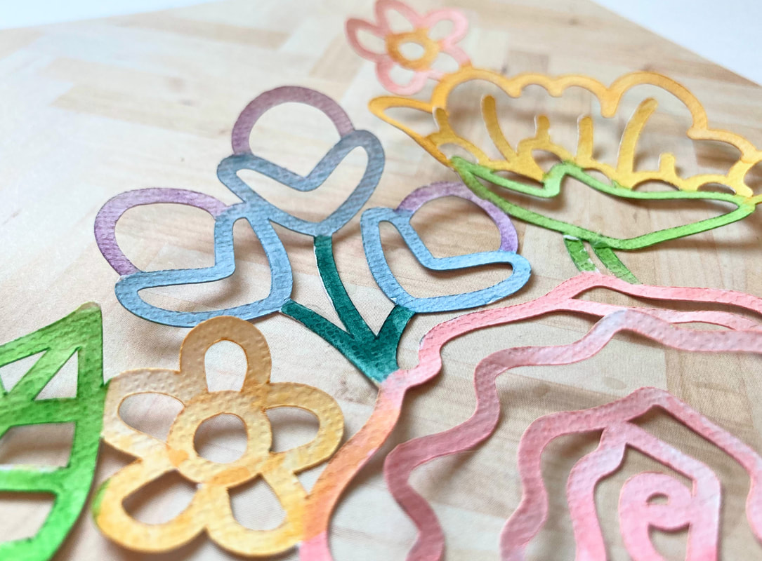
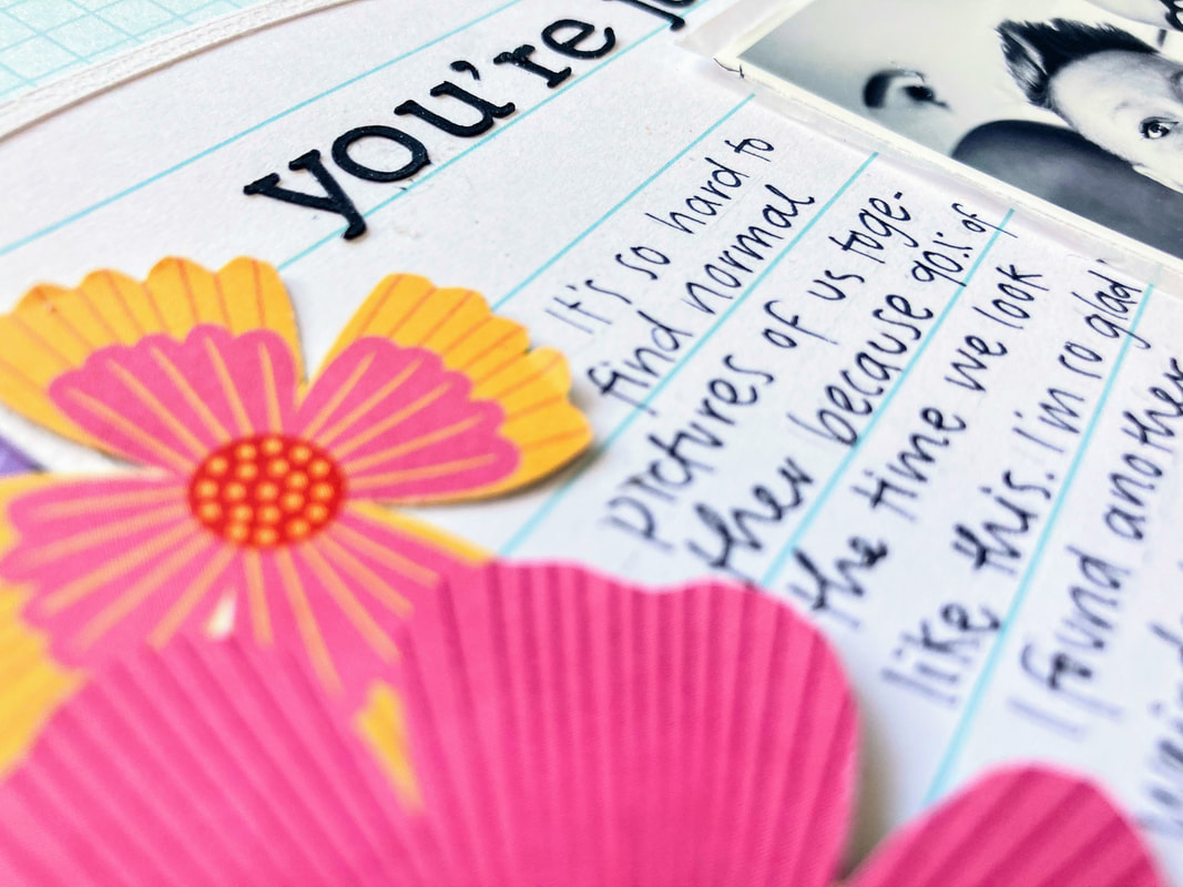
Using Mixed Media on a Cut FileHey friends! I am in loooove with today's layout. I started off with a Paige Evans cut file, which has an open book bursting with flowers. I decided that instead of backing the cut file, I would color it! So I pulled out my watercolors and ended up with this: 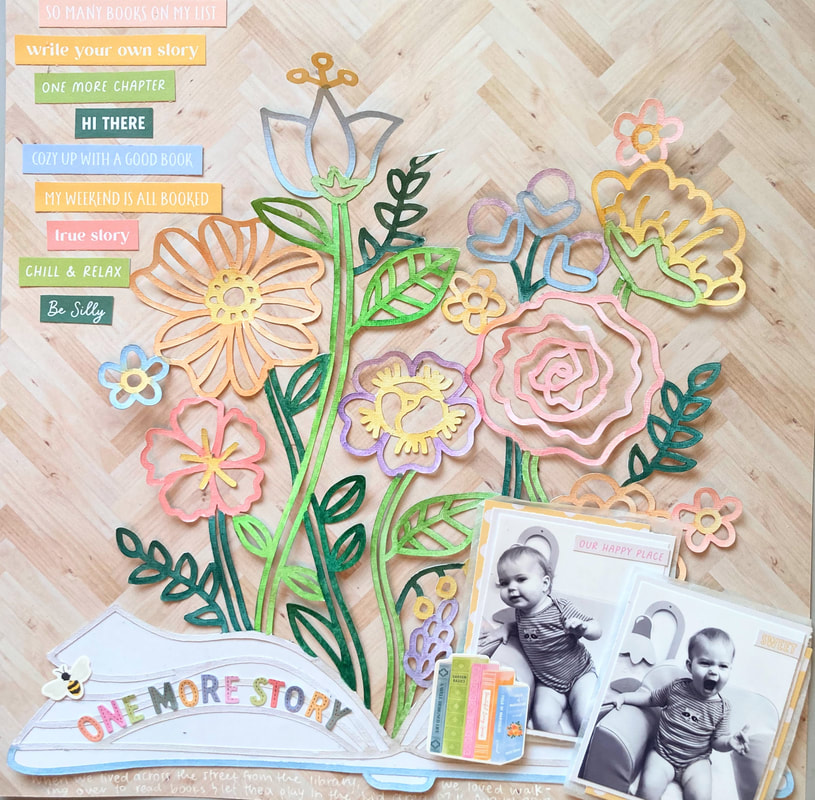 I used a combination of these Arteza watercolor tubes and two palettes from Prima: Vintage Pastels and Woodlands, which I couldn't find a link for (sorry!). I custom mixed my own colors to match this cut-apart sentiment paper from Garden Shoppe by Paige Evans. I knew I wanted to use a bunch of these little sentiments to embellish, and I think I ended up matching the colors pretty well! I also threw in a couple purple flowers because reasons. I used two baby pictures of my daughter Thea at the library and matted them with tissue paper and a yellow polka dot paper from Garden Shoppe. My title letters are from the Garden Shoppe sticker book, and I embellished with a few icons from the cardstock stickers. I know Garden Shoppe is technically a fall collection, but so far all the layouts I've made with it have been spring-themed! I think the pastel rainbow tones transfer so well from season to season. One of these layouts will be revealed in March, so stay tuned for that! It uses a cut file from Paige's new bundle of 36 stitching layouts, which you can check out here. For sneak peeks, check out my Instagram account, @stayingscrappy. I can't wait to share it with you! Stay scrappy!
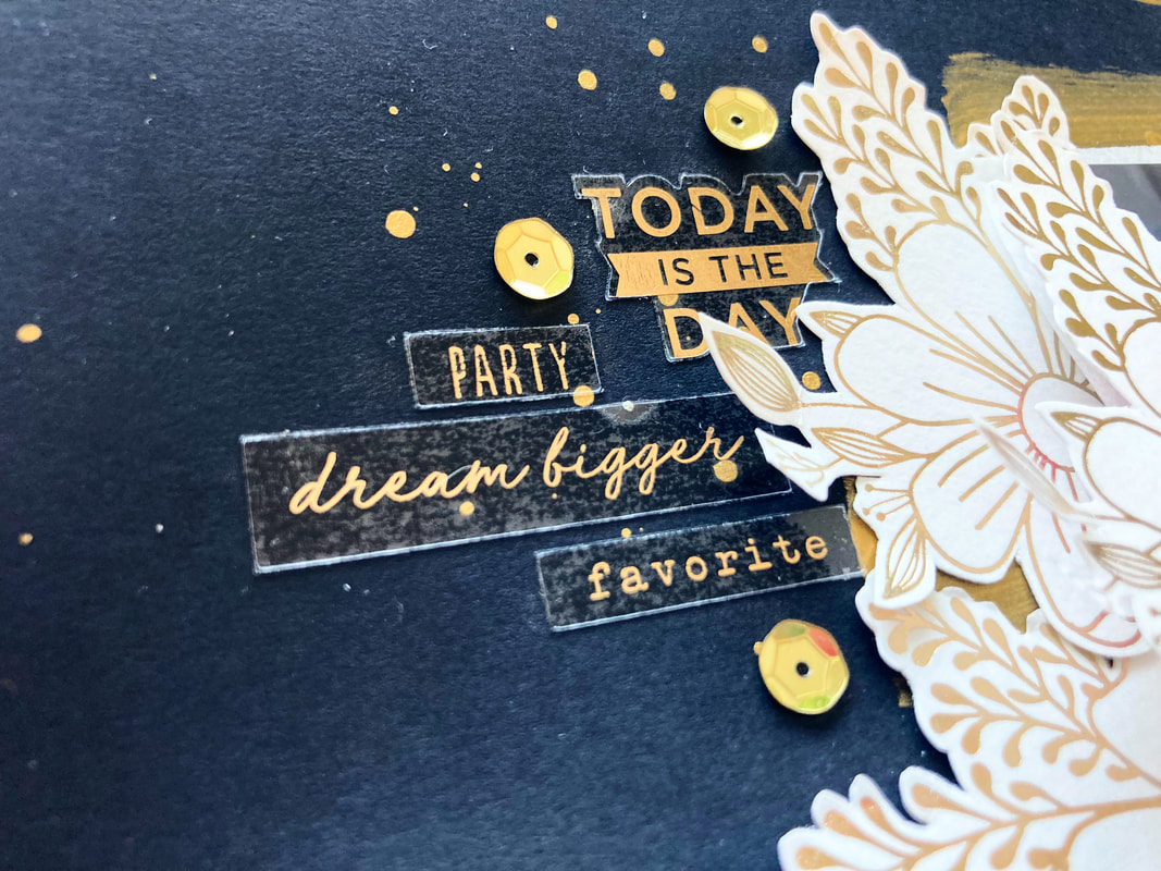
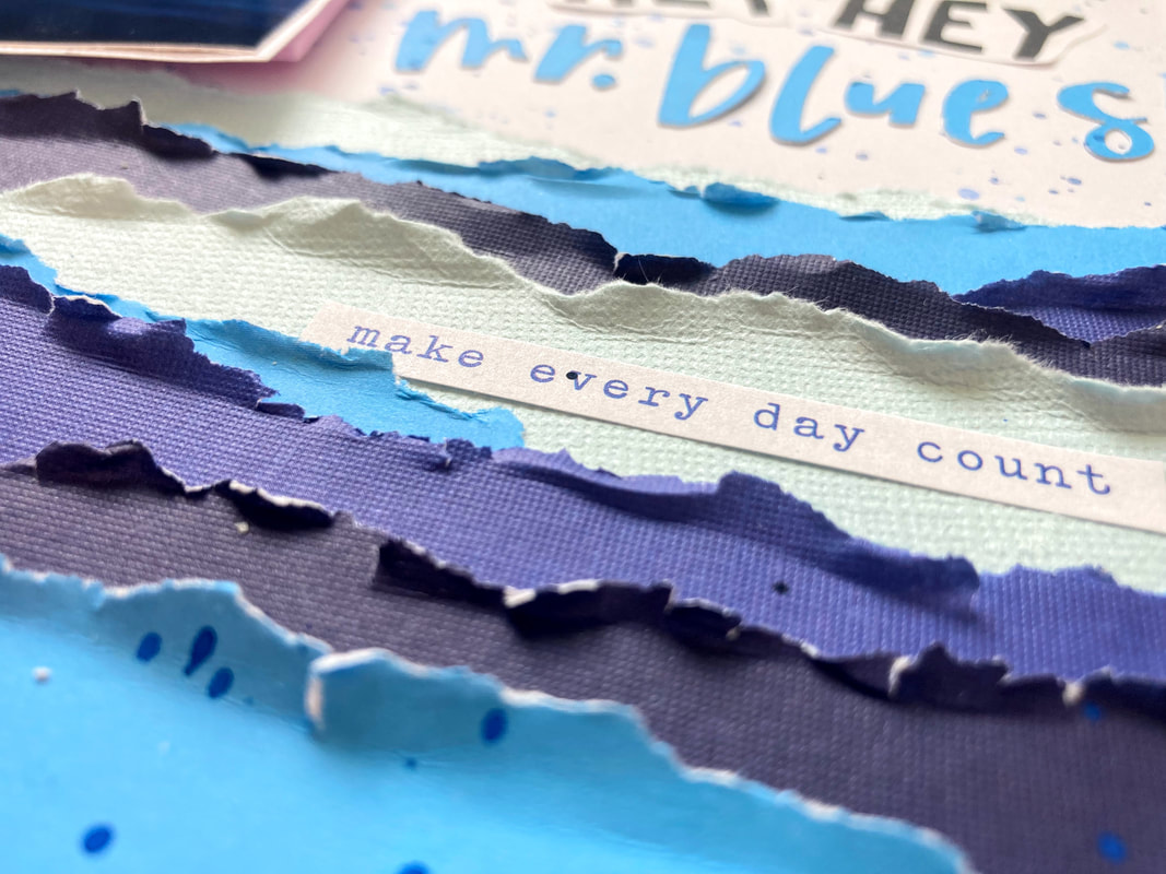
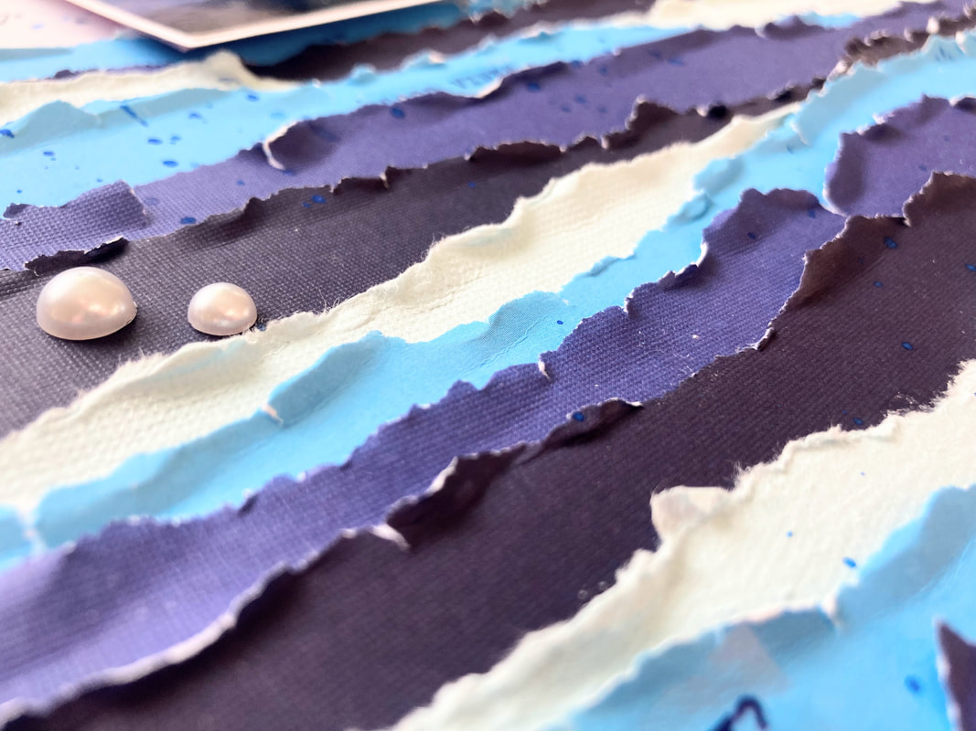
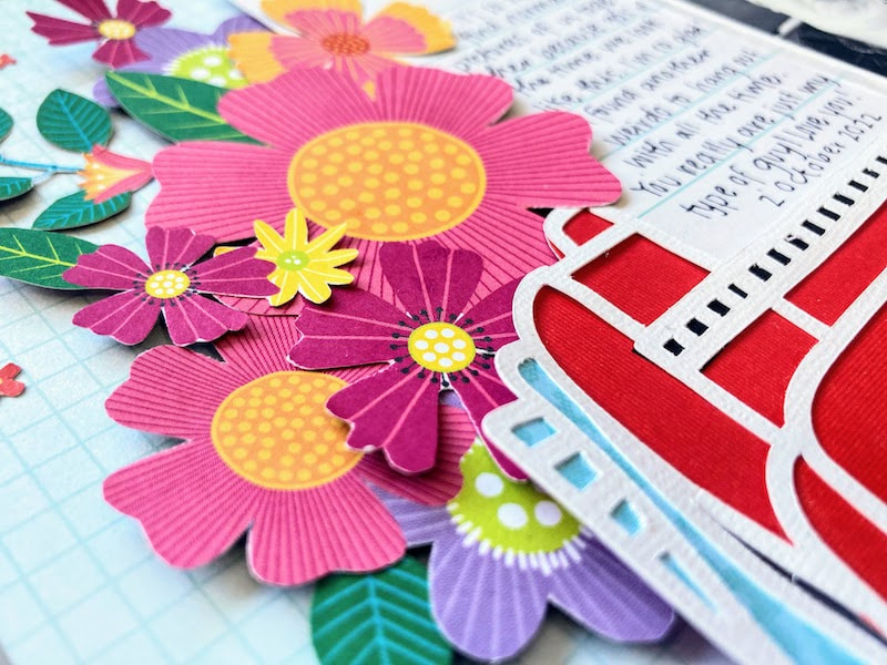
Mixed Media + Fussy CuttingOh hey there! Ready to hear about a new layout? I don't use dark backgrounds often, but when I do, I love how it makes such a bold statement on the page. This page uses black cardstock, brightened up with some gold paint stripes and fussy cut flowers. Here it is! 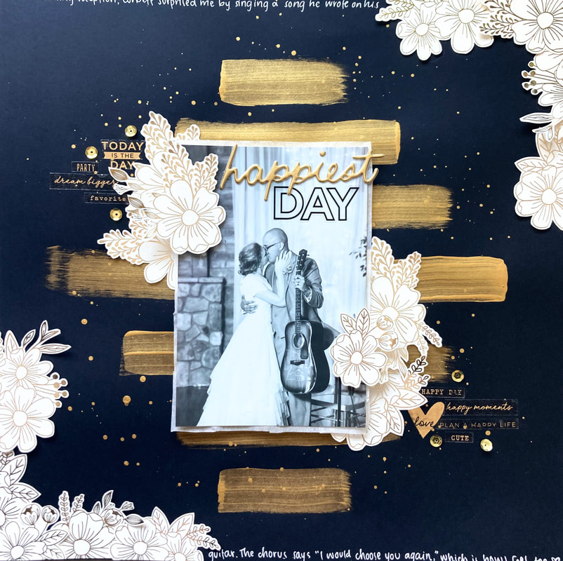 For the gold stripes, I used cheap acrylic paint with a metallic finish. You can get some at any craft store. I also watered it down to add some gold splatters. Next up: fussy cutting! I used the specialty paper from Jen Hadfield's Live and Let Grow collection. I love these gold foil flowers! I filled two opposite corners with flowers and then clustered a few around my photo. A black and white picture from my wedding matches the black and gold theme perfectly. For the title, I actually used some Christmas stickers from Crate Paper Mittens and Mistletoe. There's a pair of stickers that says "happiest holidays," so I just stole the "happiest" bit for the first part of my title. The black "day" letters come from a Park Lane sticker book. I was sooo scared to stick those clear stickers right onto my photo, but I think it fills in that extra space nicely. 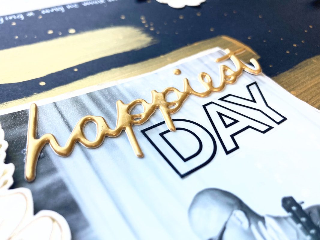 From the same Park Lane sticker book, I used transparent, gold foil stickers to create little sentiment clusters by the fussy cut flowers. I loooove how the gold foil stands out against the dark background! Lastly, I added a few sequins to the photo-adjacent clusters and a couple lines of journaling, which run along the top and bottom edges of the page. A white gel pen was perfect for popping off the black background. If you watched my last process video, then you know that I struggled long and hard to end up with a page that I was only okay with. I made this page right afterward, and it came together super fast--less than an hour from start to finish. And I like how it turned out SO much better! I guess the lesson I learned from this is that if the creative juices aren't flowing, shove your current project in a time-out corner and pull out something else. Thanks for reading, and stay scrappy! P.S. I should mention that my background was super inspired by a mixed media layout from Paige Evans, which you can watch here. Go check it out! 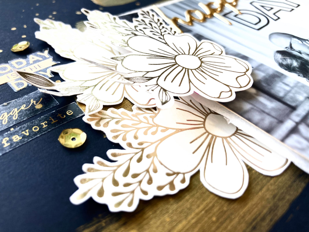 Torn Paper Strips + Planner StickersDo you ever have layouts that are just a struggle from start to finish? Well, that was the case for me with this layout. I knew I wanted to make a monochromatic blue page with a gorgeous vacation pic of the sky and the ocean. But I changed ideas SO MANY TIMES. To watch the whole process and see all the different iterations of this layout, check out my process video below. Don't have time to watch a whole video? I got you. Here's the two-sentence version: I threw out mixed media waves, stitching, ombre paper strips, a massive 8.5 x 11 photo, and one version of the title. After rejecting all those different ideas, I ended up with this: 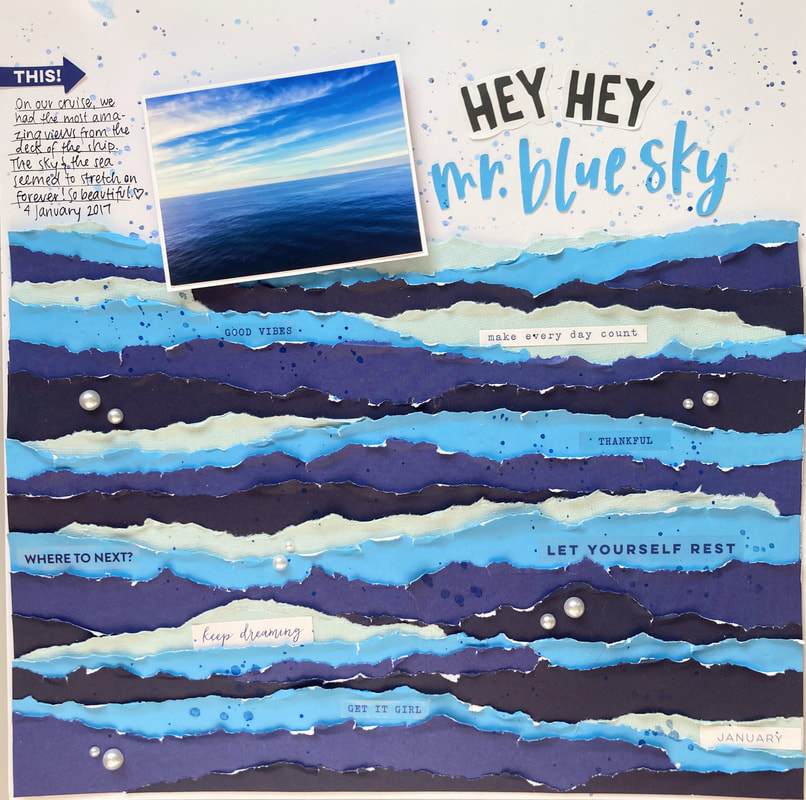 I'm still not enamored with this layout, but I DO love the torn paper strips. I used three different plain blue papers, including both sides of a double-sided cardstock, and ripped off a bunch of strips. I arranged them in a repeating order, going from the lightest blue to the darkest. To break up the busy-ness with some white space, I used plain white cardstock for the top quarter or so of the page. I added some watercolor splatters to make the white less stark. On the torn paper side, I used a whole bunch of planner stickers to add a little detail and interest to the waves. Some pearl embellishments to resemble bubbles finish up the paper strips. My photo kept reminding me of the song Mr. Blue Sky, so I used song lyrics for my title, using a combination of another planner sticker (cut in half) and letters cut with my Cricut. 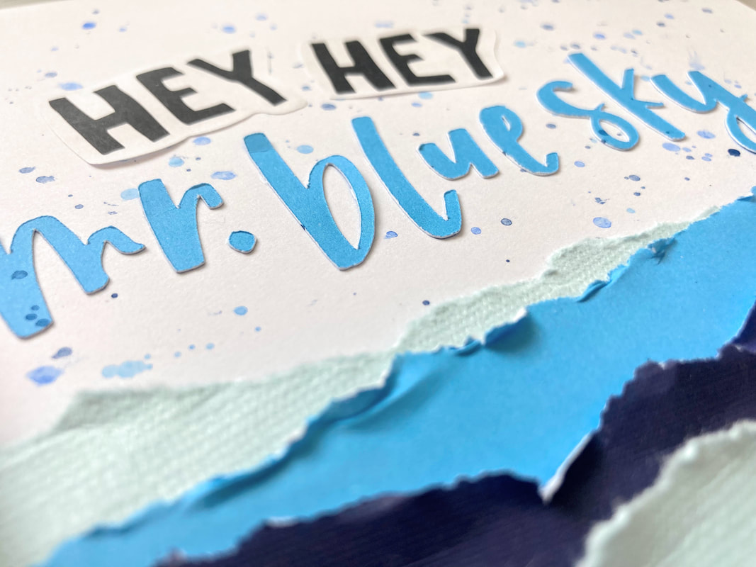 Even though I'm not in love with this layout, I had a lot of fun tearing up paper and going through my planner stickers. I would highly recommend planner sticker books for layouts because they have so many tiny sentiments and icons that make the perfect little embellishments!
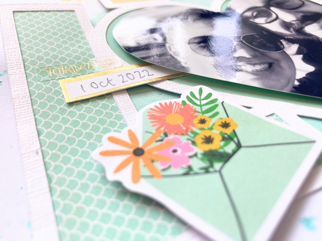
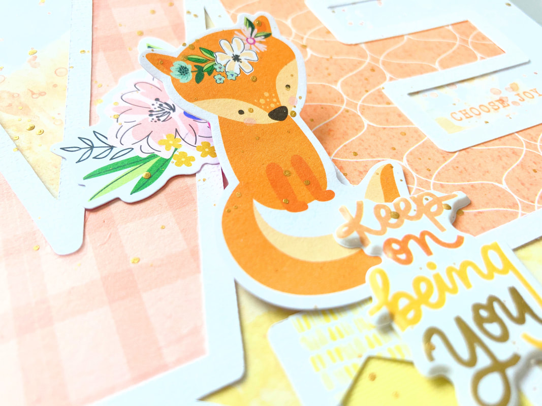
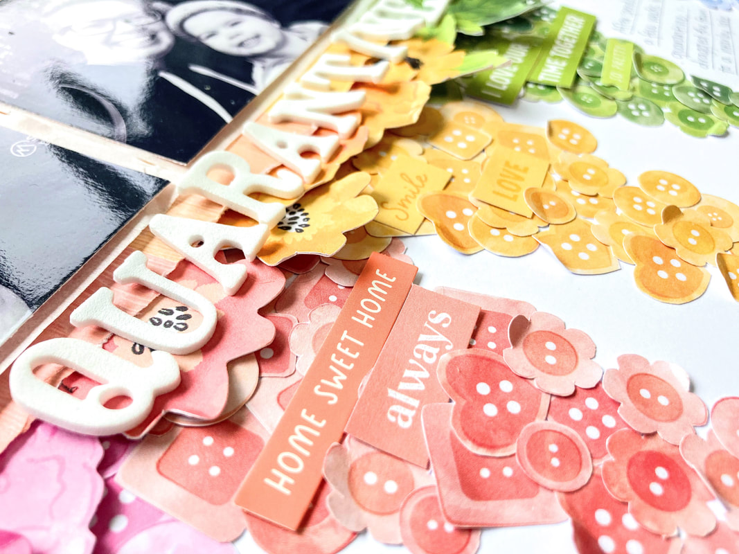
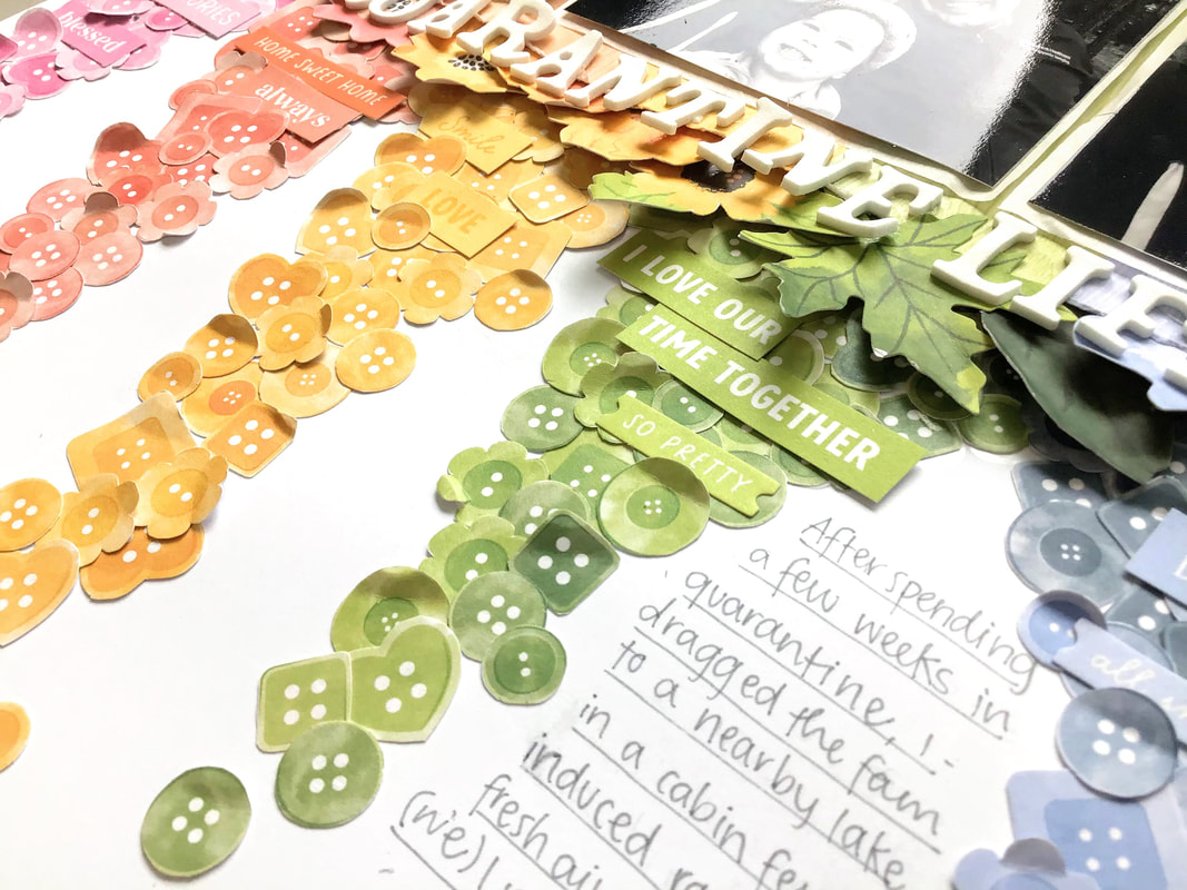
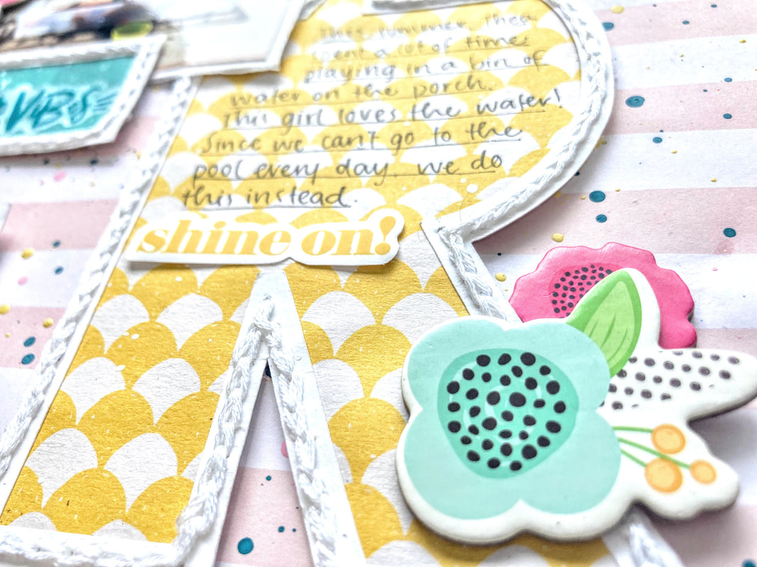
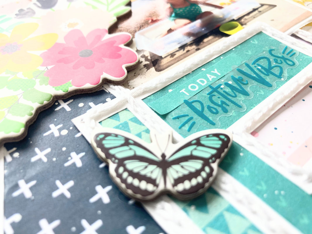
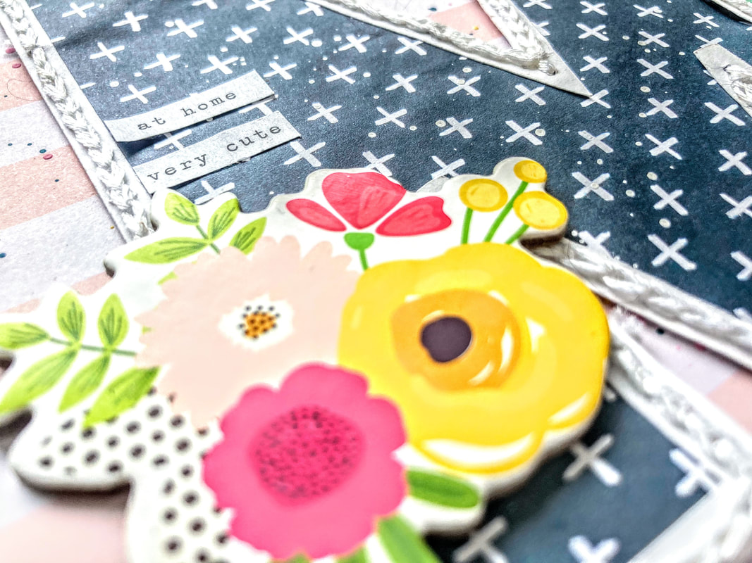
...And that wraps up this layout! Have you ever made a monochromatic page? Tell me all about it in the comments, and stay scrappy! So. Much. Fussy Cutting.Hey friends! I'm back with a new layout featuring the Garden Shoppe collection by Paige Evans. I started with this gorgeous button paper from the collection, and I had a wild idea that involved fussy cutting every. single. button. I'm crazy, I know. The idea was to concentrate the buttons at the top and have them sprinkling down toward the bottom, like rainbow confetti. Here's how it turned out! 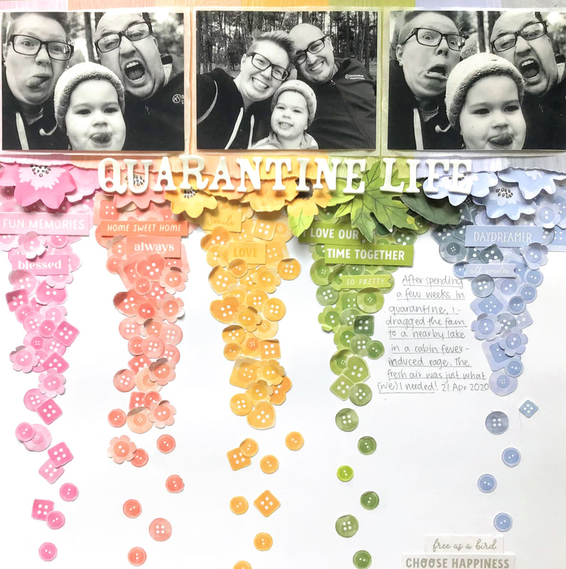 If you're like me, then it's a struggle to fit more than 1 or 2 pictures on a page. I was able to squeeze in three on this one by creating a horizontal strip that runs across the entire page. Black and white pictures make a perfect contrast to the bright rainbow of colors. I matted the photos on a rainbow woodgrain paper, also from Garden Shoppe. (I could use 10 sheets of this paper! It's so gorgeous!) Matting the photos allowed me to put the photos above the buttons instead of covering them up. I love how the stripes on the woodgrain paper match up perfectly with my rainbow of buttons! Next up: embellishments! I used the floral ephemera pack to add flowers and leaves peeking out from the bottom edge of my photos. I cut most of them in half, just to make it easier to wedge the flowers in that gap. Next I cut several sentiments from this paper and used them to embellish tone-on-tone across the buttons. It was bugging me that the gap between the green and blue buttons was bigger than the gaps between the other colors, so I decided to use that space for my journaling. Finally, I added a title with basic white foam stickers from my stash. Check out the process video above, and be sure to check out my channel @stayingscrappy for all my latest layouts! I hope you feel inspired to try incorporating multiple photos on one page. Thanks for stopping by, and stay scrappy! Cut File, Mixed Media, and More!Valentine's Day is coming up, so I have a love-themed layout to share today! I used lots of different techniques on this one, including backing a cut file, adding mixed media, and fussy cutting. This was one of those layouts where the idea came to me at 2 a.m. Considering it was a middle-of-the-night idea, I think it turned out pretty well! 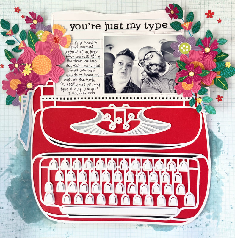 I was super inspired by the typewriter icons in the Paige Evans Splendid collection. I basically took one of those and blew it up on a large scale to fill up the entire layout. This worked out great because I didn't have to make so many decisions about what color to make the typewriter or what flowers to embellish with. To start off, I cut and backed this adorable typewriter cut file, also by Paige Evans. I used red cardstock from my stash and a lined paper from Splendid. To make the spacebar and other typewriter keys more dimensional, I backed each one with itty bitty pieces of foam. I love how it mimics the way real typewriter keys stick up. Next I chose a light blue grid paper from BoBunny for my background. I decided to jazz up the area beneath the bottom of the typewriter with some mixed media, so I pulled out one of my favorite Lindy's Gang Magical Powders: Jana's Jade. A tiny title in a typewriter font, fussy cut flowers, and lots of journaling finish up the page. Be sure to check out the process video below! And if you want more scrappy content, be sure to subscribe for all the latest process videos. Overall, I can't say this is my favorite layout I've ever made, but it's good enough. And sometimes good enough...is good enough. Thanks for stopping by today, and stay scrappy! Stash Busting PageWelcome, fellow paper gremlins! It's still freeeeezing cold here, and I'm getting real tired of it. So here's a bright, summery layout to brighten things up! This layout is a true stash buster--it uses an eclectic mix of patterned paper, cardstock, chipboard, and planner stickers, all from different collections and manufacturers. Ready to see it? 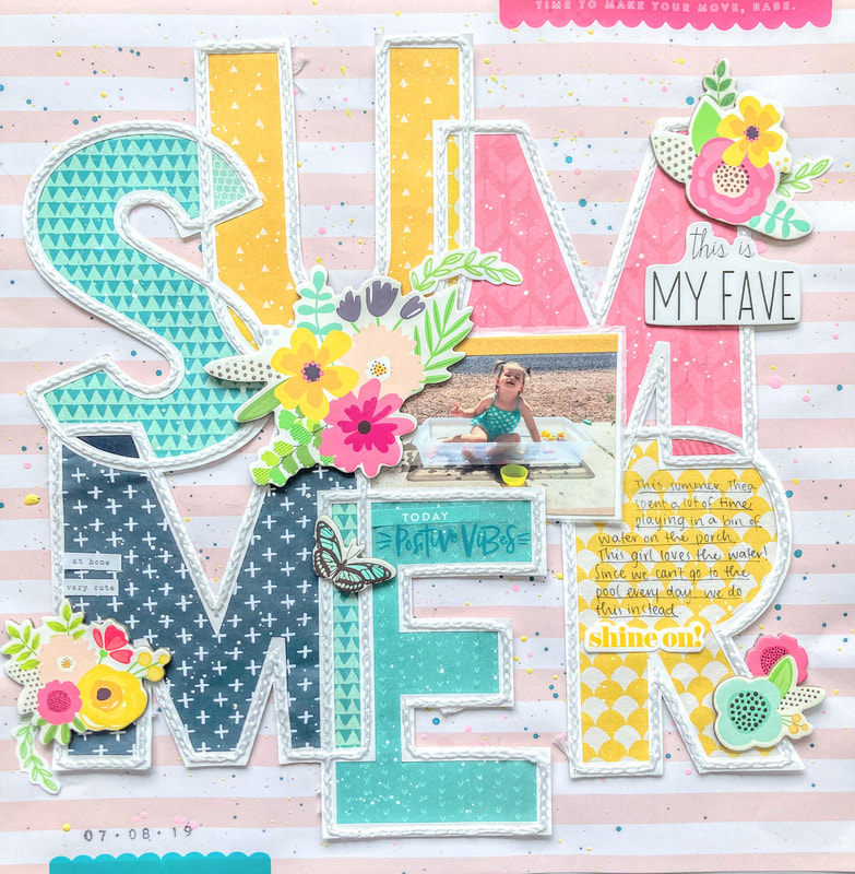 What do you think? To start off, I splattered a pink and white striped background paper with blue, yellow, and pink paint. Next I backed this "SUMMER" cut file by Paige Evans, using mostly scraps from my stash. Stitching around the entire cut file took the most time, but I think the results are totally worth it. Chipboard & planner stickers, some journaling, and the stamped date finish up the page. I hope this layout inspires you to mix and match some products from your stash. Check out the detail shots below, and stay scrappy! -Heather Quick & Easy LayoutIt’s Heather again, back with a layout that came together SO quickly with the help of a cut file and some fussy cut flowers. Let’s get into it! The initial version of this page was inspired by a Paige Evans process video, which you can watch here. As in the process video, I started out with a mixed media background, using a mix of plain old watercolors and some Lindy's Gang Magical Powders. I used a white background with white hearts, which acted as a resist to all that watercolor. I also cut an ampersand cut file from Paige Evans, fussy cut some flowers, and arranged it all on my page. At this point, it looked like this: 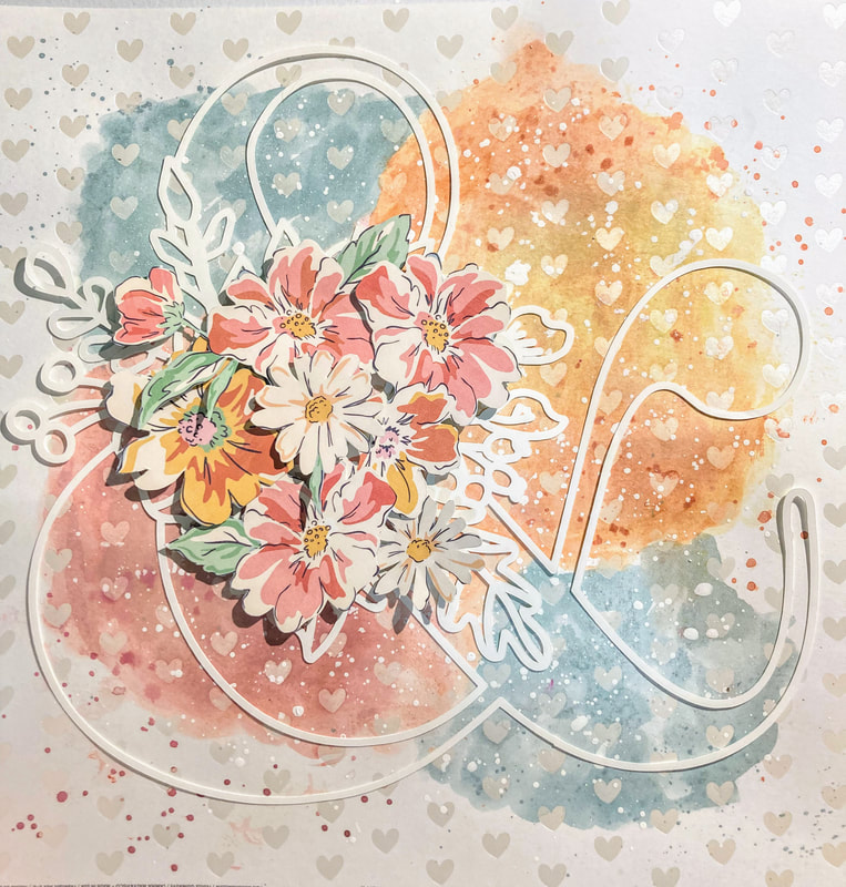 I liked it well enough, but I had one big problem: I just wasn't finding a picture that matched the light, airy vibe of the page. So I changed tack completely and swapped out my mixed media background for a gray hearts paper from the Maggie Holmes Round Trip collection. I kept my fussy cut Dear Lizzy flowers, added a black foam title, and matted two pictures of my sweet pups, Petra and Cayde-6. Here's how the final page turned out! 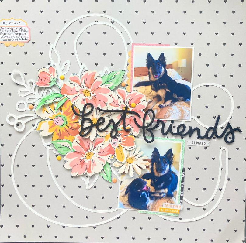 I love how the bright flowers pop off the neutral background. A few puffy dots, a couple stickers, and little journaling card finish up the page! Should I have kept the mixed media background, or do you like the little black hearts? If you were a fan of the mixed media, never fear--I'm holding on to it for a future layout. Stay scrappy! 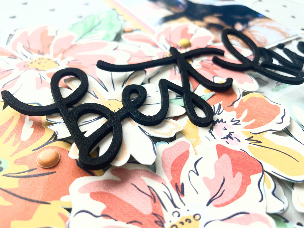 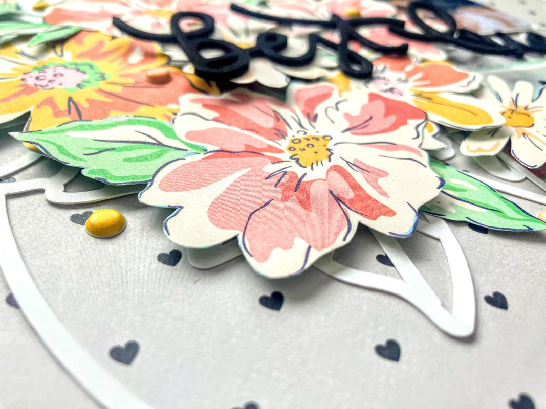 Snowflakes Galore!Heather here! It's been snowing a lot where I live, so I thought I'd share this snowy mixed media layout I made a while back. Here it is! 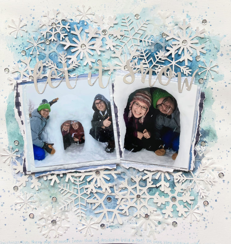 To make this layout, I started by coating a piece of textured white cardstock with clear gesso. Then I added lots of watercolor mixed media, using both regular watercolors and mixing in some Lindy's Gang magical powders in the color "Jana's Jade" (one of my faves!). 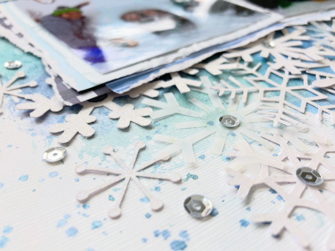 I printed my pictures and layered them up with tissue paper, patterned paper, and some blue cardstock. Next up: snowflakes! I picked out some Cricut Design Space files and cut a mixture of snowflake shapes from white, glittery cardstock and vellum. The "Let It Snow" title is cut from shiny, metallic paper and placed above the photos. Silver sequins add a bit of sparkle to finish up the page. That wraps up this snowy, winter layout! Stay cozy! 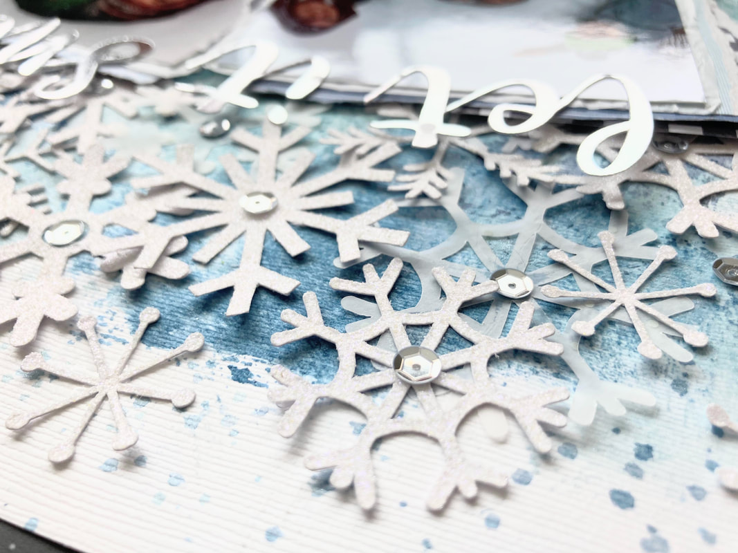 |
AuthorHi! I'm Heather, a paper gremlin with a glue bottle and too many ideas. Come see what I'm making! ArchivesCategories |


 RSS Feed
